Now, let's quickly review the most commonly used utility classes, and then we will employ that knowledge in practice by making a simple application layout.
Use w-{number} to set an element to a fixed width or h-{number} to select an element to a fixed height.
There are also unique variations for these utilities.
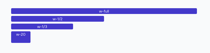
Use w-{fraction} or w-full to set an element to a percentage-based width. For example, w-1/2 and w-1/3. The w-full class will set width to 100%. The w-screen makes an element to span the entire width of the viewport.
The h-full will set an element’s height to 100% of its parent as long as the parent has a defined height. The h-screen class makes an element to span the entire height of the viewport.
Example:
<div class="w-full bg-indigo-700 text-white text-center rounded">w-full</div><div class="w-1/2 bg-indigo-700 text-white text-center rounded">w-1/2</div><div class="w-1/3 bg-indigo-700 text-white text-center rounded">w-1/3</div><div class="w-20 h-12 bg-indigo-700 text-white text-center rounded">w-20</div>Result:
You can control the margin on one side of an element using the m{t|r|b|l}-{size} utilities.
For example, mt-6 would add 1.5rem of margin to the top of an element, mr-4 would add 1rem of margin to the right of an element, mb-8 would add 2rem of margin to the bottom of an element, and ml-2 would add 0.5rem of margin to the left of an element.
Add horizontal margin to both sides with mx-{size} class, and vertical with my-{size} class.
Use the m-{size} class to add a margin on all sides of an element.
If you need to use a one-off margin value, use square brackets to generate a property on the fly using any arbitrary value, like m-[5px]
The same logic applies when using padding, except at the beginning, it is p instead of m, like p{t|r|b|l}-{size}.
Example:
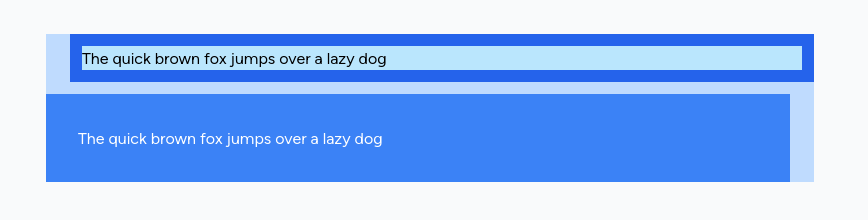
<div class="max-w-3xl bg-blue-200"> <div class="p-3 ml-6 bg-blue-600"> <div class="bg-sky-200">The quick brown fox jumps over a lazy dog</div> </div> <div class="p-8 bg-blue-500 mt-3 mr-6 text-white">The quick brown fox jumps over a lazy dog</div></div>Result:
You can set font size using text-{xs,sm,base,lg,xl,2xl..9xl} classes.
Font weight can be set using font-{normal,medium,semibold,bold} classes.
Set text alignment of an element using the text-left, text-center, text-right, and text-justify classes.
Text decoration and transformation
The uppercase and lowercase will uppercase and lowercase text, respectively, whereas the capitalize class will convert text to title-case. The normal-case class can be used to preserve the original casing — typically to reset capitalization. To underline text, use the underline class.
Example:
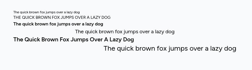
<div class="text-xs">The quick brown fox jumps over a lazy dog</div><div class="text-sm uppercase">The quick brown fox jumps over a lazy dog</div><div class="text-base font-semibold">The quick brown fox jumps over a lazy dog</div><div class="text-lg text-center">The quick brown fox jumps over a lazy dog</div><div class="text-xl font-semibold capitalize">The quick brown fox jumps over a lazy dog</div><div class="text-2xl text-right">The quick brown fox jumps over a lazy dog</div>Result:
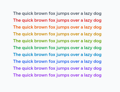
You specify text or background colors using text-{color}-{shade} or bg-{color}-{shade} classes. Tailwind offers a lot of built-in colors. You can combine color names and shade numbers from 50 to 950, for example `text-lime-500.
Example:
<div class="text-gray-600 font-semibold">The quick brown fox jumps over a lazy dog</div><div class="text-red-600 font-semibold">The quick brown fox jumps over a lazy dog</div><div class="text-orange-600 font-semibold">The quick brown fox jumps over a lazy dog</div><div class="text-yellow-600 font-semibold">The quick brown fox jumps over a lazy dog</div><div class="text-lime-600 font-semibold">The quick brown fox jumps over a lazy dog</div><div class="text-green-600 font-semibold">The quick brown fox jumps over a lazy dog</div><div class="text-sky-600 font-semibold">The quick brown fox jumps over a lazy dog</div><div class="text-blue-600 font-semibold">The quick brown fox jumps over a lazy dog</div><div class="text-violet-600 font-semibold">The quick brown fox jumps over a lazy dog</div><div class="text-purple-600 font-semibold">The quick brown fox jumps over a lazy dog</div>Result:
To set the border width for all sides of an element, use the border, border-0, border-2, border-4, or border-8 classes.
Use the border-{side}, border-{side}-0, border-{side}-2, border-{side}-4, or border-{side}-8 utilities to set the border width for one side of an element.
Where {side} use one of the following:
t - for top
r - for right
b - for bottom
l - for left
Border color can be set like text or background: border-{color}-{shade}. Do you see a pattern?
Rounded corners
To make elements with rounded corners, use the rounded-sm, rounded, rounded-lg, or rounded-full classes.
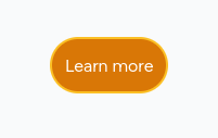
This example will set the border of the element and the border's color to amber-400.
<button class="border-2 border-amber-400 rounded-full bg-amber-600 text-white p-3">Learn more</button>Result:
Tailwind lets you conditionally apply utility classes in different states using variant modifiers. For example, use hover:underline to apply only the underline utility on hover.
The focus:bg-red-600 class will change the element's background in direction.
You can combine several utility classes on the element with the same modifier:
<a href="#" class="hover:text-indigo-500 hover:underline">Link</a>