It is easy to work and style components using Tailwind. However, manually assigning classes is sometimes not the most convenient way when you want to get started quickly.
Tailwind has libraries with many prebuilt components, such as buttons, tables, and sections.
However, not all of them are entirely free, and some libraries have paid versions along with the free ones.
TailwindUI is a component library by the creators of TailwindCSS. If you have Tailwind installed, you can grab snippets straight from the library and immediately use them.
Let's see that in action, grab Input component and put it on a new demo page:
resources/views/tailwindui.blade.php
<html class="h-full bg-gray-100"> <head> <link rel="preconnect" href="https://fonts.bunny.net"> <link href="https://fonts.bunny.net/css?family=figtree:400,600&display=swap" rel="stylesheet" /> @vite(['resources/css/app.css', 'resources/js/app.js'])</head> <body class="h-full"> <div class="max-w-md mx-auto mt-4"> <label for="price" class="block text-sm font-medium leading-6 text-gray-900">Price</label> <div class="relative mt-2 rounded-md shadow-sm"> <div class="pointer-events-none absolute inset-y-0 left-0 flex items-center pl-3"> <span class="text-gray-500 sm:text-sm">$</span> </div> <input type="text" name="price" id="price" class="block w-full rounded-md border-0 py-1.5 pl-7 pr-20 text-gray-900 ring-1 ring-inset ring-gray-300 placeholder:text-gray-400 focus:ring-2 focus:ring-inset focus:ring-indigo-600 sm:text-sm sm:leading-6" placeholder="0.00"> <div class="absolute inset-y-0 right-0 flex items-center"> <label for="currency" class="sr-only">Currency</label> <select id="currency" name="currency" class="h-full rounded-md border-0 bg-transparent py-0 pl-2 pr-7 text-gray-500 focus:ring-2 focus:ring-inset focus:ring-indigo-600 sm:text-sm"> <option>USD</option> <option>CAD</option> <option>EUR</option> </select> </div> </div> </div></body> </html>Define a route and see the result by visiting the /tailwindui URL.
routes/web.php
Route::view('/tailwindui', 'tailwindui');
Pros:
Cons:
Flowbite is one of the most popular open-source libraries of Tailwind components. Some components are interactive, and their functionality is already implemented with JS and included in a bundle.
Make sure that you have Tailwind CSS installed.
npm install flowbite --save-devtailwind.config.js file and add content path to flowbite to apply the classes from the interactive elements:tailwind.config.js
import flowbitePlugin from 'flowbite/plugin'; export default { content: [ './vendor/laravel/framework/src/Illuminate/Pagination/resources/views/*.blade.php', './storage/framework/views/*.php', './resources/views/**/*.blade.php', './node_modules/flowbite/**/*.js' ], // ... plugins: [ flowbitePlugin ],};flowbite in your main app.js file that powers the interactive elements.resources/js/app.js
import 'flowbite'; Let's try out some components. In this example, we took Card and Button components.
Create a new view:
resources/views/flowbite.blade.php
<html> <head> <link rel="preconnect" href="https://fonts.bunny.net"> <link href="https://fonts.bunny.net/css?family=figtree:400,600&display=swap" rel="stylesheet" /> @vite(['resources/css/app.css', 'resources/js/app.js'])</head> <body class="bg-gray-50 m-6"> <a href="#" class="block max-w-sm p-6 bg-white border border-gray-200 rounded-lg shadow hover:bg-gray-100 dark:bg-gray-800 dark:border-gray-700 dark:hover:bg-gray-700"> <h5 class="mb-2 text-2xl font-bold tracking-tight text-gray-900 dark:text-white">Noteworthy technology acquisitions 2021</h5> <p class="font-normal text-gray-700 dark:text-gray-400">Here are the biggest enterprise technology acquisitions of 2021 so far, in reverse chronological order.</p> </a> <button type="button" class="text-white bg-green-700 hover:bg-green-800 focus:outline-none focus:ring-4 focus:ring-green-300 font-medium rounded-full text-sm px-5 py-2.5 text-center me-2 mb-2 dark:bg-green-600 dark:hover:bg-green-700 dark:focus:ring-green-800 mt-4">Green</button></body> </html>Register a route:
routes/web.php
Route::view('/flowbite', 'flowbite');When you visit the /flowbite URL, you should see the card and the button we created.

Pros:
Cons:
DaisyUI is another popular Tailwind component library. The main difference between this library and previous ones is that it adds semantic class names on top of Tailwind. DaisyUI has more of a Bootstrap feeling, not sacrificing the flexibility of Tailwind.
npm install daisyui@latest --save-devtailwind.config.js
import daisyui from 'daisyui'; export default { // ... plugins: [ daisyui ],};Add the Alert and Stat component to a new page:
resources/views/daisyui.blade.php
<html> <head> <link rel="preconnect" href="https://fonts.bunny.net"> <link href="https://fonts.bunny.net/css?family=figtree:400,600&display=swap" rel="stylesheet" /> @vite(['resources/css/app.css', 'resources/js/app.js'])</head> <body> <div class="max-w-md mx-auto mt-4"> <div role="alert" class="alert"> <svg xmlns="http://www.w3.org/2000/svg" fill="none" viewBox="0 0 24 24" class="stroke-info shrink-0 w-6 h-6"> <path stroke-linecap="round" stroke-linejoin="round" stroke-width="2" d="M13 16h-1v-4h-1m1-4h.01M21 12a9 9 0 11-18 0 9 9 0 0118 0z"></path> </svg> <span>12 unread messages. Tap to see.</span> </div> <div class="stats shadow mt-4"> <div class="stat"> <div class="stat-title">Total Page Views</div> <div class="stat-value">89,400</div> <div class="stat-desc">21% more than last month</div> </div> </div> </div></body> </html>Register new route:
routes/web.php
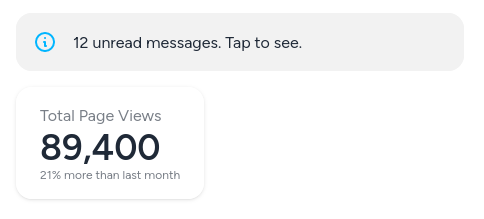
Route::view('/daisyui', 'daisyui');To see the result, visit the /daisyui URL:

We immediately notice that HTML using semantic classes has much less code.
The alert class styles the element as an alert. Tailwind utility classes are still available. For instance, use the shadow-lg class to add a shadow on the alert element.
<div role="alert" class="alert shadow-lg">To learn more about component classes, visit the documentation.
Pros:
Cons: