Let's see how these small utility classes work together. Please refer to Lesson 6 if you still need to set up Tailwind. If you have Laravel Breeze installed, you're good to go.
That is the Tailwind config file we will use for this chapter.
tailwind.config.js
import defaultTheme from 'tailwindcss/defaultTheme';import forms from '@tailwindcss/forms';import colors from 'tailwindcss/colors'; /** @type {import('tailwindcss').Config} */export default { content: [ './vendor/laravel/framework/src/Illuminate/Pagination/resources/views/*.blade.php', './storage/framework/views/*.php', './resources/views/**/*.blade.php', ], theme: { extend: { colors: { ...colors }, fontFamily: { sans: ['Figtree', ...defaultTheme.fontFamily.sans], }, }, }, plugins: [forms],};Create the main layout component and two views via Artisan:
php artisan make:component CustomLayoutphp artisan make:view profilephp artisan make:view tableAnd add routes to views. We do not need controllers to develop the layout.
routes/web.php
Route::view('/profile', 'profile');Route::view('/table', 'table');Now, update the main layout component.
resources/views/components/custom-layout.blade.php
<html> <head> <link rel="preconnect" href="https://fonts.bunny.net"> <link href="https://fonts.bunny.net/css?family=figtree:400,600&display=swap" rel="stylesheet" /> @vite(['resources/css/app.css', 'resources/js/app.js']) </head> <body class="flex flex-col min-h-screen"> <nav class="border-b shadow"> <div class="max-w-6xl mx-auto"> <div class="flex flex-row gap-2 h-12 items-center"> <a href="/profile" class="hover:text-indigo-500 hover:underline">Profile</a> <a href="/table" class="hover:text-indigo-500 hover:underline">Table</a> </div> </div> </nav> <main class="bg-gray-100 grow"> {{ $slot }} </main> <footer class="border-t"> <div class="flex flex-row items-center justify-end h-12 max-w-6xl mx-auto"> <div>{{ date('Y') }}</div> </div> </footer> </body></html>Forms are a part of every website, so let's create one. Update the profile view as follows:
resources/views/profile.blade.php
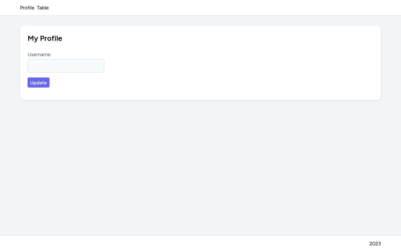
<x-custom-layout> <div class="bg-white mt-8 max-w-6xl mx-auto rounded-xl p-6 shadow"> <h1 class="text-2xl font-bold capitalize">my profile</h1> <form class="flex flex-col items-start mt-6" action="" onSubmit="return false;"> <label class="text-gray-600" for="username">Username</label> <input class="rounded-lg bg-gray-50 focus:bg-white border border-gray-300 mt-1" type="text" id="username" required /> <button class="bg-indigo-500 text-white font-bold px-2 py-1 rounded hover:bg-indigo-600 mt-4">Update</button> </form> </div></x-custom-layout>Then, compile all the assets:
npm run devLet's look at form elements and the classes applied to them.
<label class="text-gray-600" for="username">Username</label> <input class="rounded-lg bg-gray-50 focus:bg-white border border-gray-300 mt-1" type="text" id="username" required /> <button class="bg-indigo-500 text-white font-bold px-2 py-1 rounded hover:bg-indigo-600 mt-4">Update</button>Here's what these classes do:
Label:
text-gray-600 - Applies gray color to the labelInput:
rounded-lg - makes corners of the input field roundedbg-gray-50 - sets the background color to light grayfocus:bg-white - when the input field is in focus (selected), the background will turn whiteborder - adds a border to the input fieldborder-gray-300 - sets border color to gray-300
mt-1 - adds top margin to push input field downButton:
bg-indigo-500 - sets button color to indigo-500
text-white - sets button color to white
font-bold - makes the text of the button bold
px-2 - adds a padding of 0.5rem to both the left and right sides
py-1 - adds a padding of 0.25rem to the top and bottom of the button
rounded - makes button corners rounded
hover:bg-indigo-600 - when you hover the button with the mouse, the background will turn into a bit darker indigo-600 color
mt-4 - adds a top margin of 1rem.
And when you visit the /profile URL, you should see the result.

Let's style a table but make our own reusable table class this time.
Update the table page:
resources/views/table.blade.php
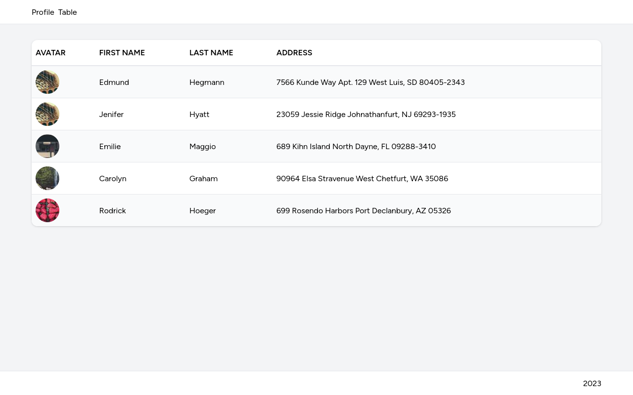
<x-custom-layout> <div class="bg-white max-w-6xl mx-auto my-8 rounded-xl shadow overflow-hidden overflow-y-auto"> <table class="table"> <thead> <tr> <th>Avatar</th> <th>First name</th> <th>Last name</th> <th>Address</th> </tr> </thead> <tbody> @for($i = 0; $i < 5; $i++) <tr> <td><img src="https://picsum.photos/seed/{{ $i }}/48" alt="" class="rounded-full"></td> <td>{{ fake()->firstName() }}</td> <td>{{ fake()->lastName() }}</td> <td>{{ fake()->address() }}</td> </tr> @endfor </tbody> </table> </div></x-custom-layout>Then, we can define essential styles for children elements of the table in the app.css file.
resources/css/app.css
@tailwind base;@tailwind components;@tailwind utilities; @layer components { .table { @apply w-full } .table td { @apply p-2 } .table thead th { @apply font-bold text-left px-2 py-4 uppercase border-b-2 } .table tbody tr { @apply border-b odd:bg-gray-50 last:border-b-0 }}.table:
w-full - sets the width of the table to 100%
.table td:
p-2 - sets a padding of all sides to all cells to 0.5rem (8px).table thead th, these classes will be applied to all table header cells:
font-bold - makes font boldtext-left - aligns text to the left sidepx-2 - adds padding to the left and right sidepy-4 - adds padding to the top and bottom; we set this value higher to make it talleruppercase - all column names are set to be uppercaseborder-b-2 - adds thicker border to the bottom of the table header.table tbody tr:
border-b - adds a border to the bottom of each rowodd:bg-gray-50 - every odd row will have a gray-50 background to achieve a striped table effect. You can also use the even: modifier to style even rows.last:border-b-0 - removes the bottom border from the last rowVisit the /table URL to see the result.
