One of the most popular simple JavaScript libraries for charts is Chart.js. Let's see how to use it in Laravel, with three practical examples: bar, line, and pie charts.
In this tutorial, we will create three charts based on "users" DB table:
birth_date field and build a "pie" chart of birthdays per season: winter/spring/summer/fall.But before building those charts, we need to have some kind of visual layout, and the data in the DB to show on the charts, right?
For this tutorial, we will use our own Laravel Breeze Skeleton that gives us a simple design.

Next, the database schema. We'll add a birth_date field to the users table, in the default migration.
database/migrations/2014_10_12_000000_create_users_table.php:
class CreateUsersTable extends Migration{ public function up() { Schema::create('users', function (Blueprint $table) { $table->id(); $table->string('name'); $table->string('email')->unique(); $table->date('birth_date')->nullable(); $table->timestamp('email_verified_at')->nullable(); $table->string('password'); $table->rememberToken(); $table->timestamps(); }); }Next, the fake data. We will edit a UserFactory to create data for charts: randomize the birth_date and created_at field values.
database/factories/UserFactory.php:
public function definition(){ return [ 'name' => $this->faker->name(), 'email' => $this->faker->unique()->safeEmail(), 'birth_date' => $this->faker->dateTimeBetween('-72 years', '-2 years'), 'email_verified_at' => now(), 'password' => '$2y$10$92IXUNpkjO0rOQ5byMi.Ye4oKoEa3Ro9llC/.og/at2.uheWG/igi', // password 'remember_token' => Str::random(10), 'created_at' => $this->faker->dateTimeBetween('-30 days'), ];}Also, we will change the UserSeeder count to 1000 so that we would have more data.
public function run(){ User::factory(1000)->create(); }Run php artisan migrate --seed to run migrations and seed data.
Before showing the charts, we need to add the Chart.js library to our app. For this demo, we will use the link from CDN. In layouts/app.blade.php of Laravel Breeze, add a script tag with CDN and a @stack('scripts') blade directive before the </body> tag.
resources/layouts/app.blade.php:
<script src="https://cdn.jsdelivr.net/npm/chart.js"></script> @stack('scripts') </body></html>Now ,on every page where you want to add charts, you need to add a canvas tag:
<canvas id="myChart"></canvas>Now, we need to add the JS. On every page with charts, add this code before </x-app-layout>:
@push('scripts') <script> const myChart = new Chart( document.getElementById('myChart'), config ); </script> @endpush</x-app-layout>This will create a chart on canvas with id #myChart. We will add the config later.
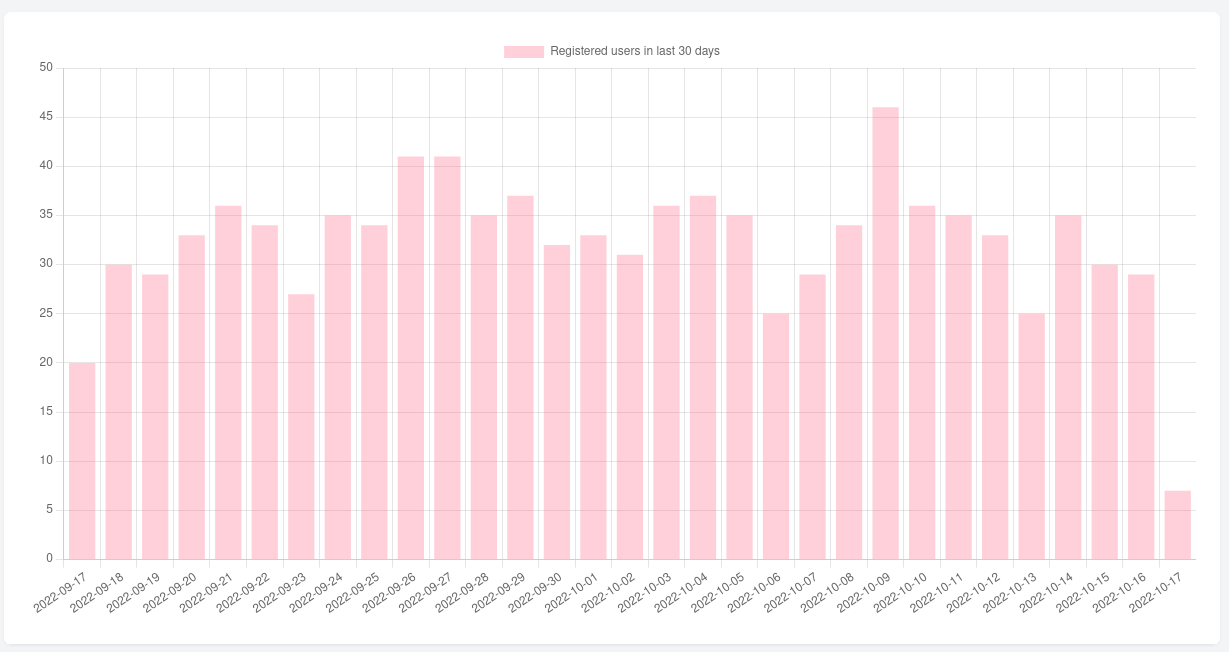
For the bar chart, we will make a chart of how many users registered in the last 30 days. In your Controller, add this Eloquent query code, and return it to view. For this example, we will add it to $data variable.
$data = User::selectRaw("date_format(created_at, '%Y-%m-%d') as date, count(*) as aggregate") ->whereDate('created_at', '>=', now()->days('-30')) ->groupBy('date') ->get(); return view('home', compact('data'));In this query, we explicitly select the created_at field as date, so that we could group by it in SQL query, instead of grouping it later (and slower) in the Collections.
Now, let's add this data to the chart. In your view file, in @push() blade directive add this code:
@push('scripts') <script> const data = { labels: @json($data->map(fn ($data) => $data->date)), datasets: [{ label: 'Registered users in last 30 days', backgroundColor: 'rgb(255, 99, 132, 0.3)', borderColor: 'rgb(255, 99, 132)', data: @json($data->map(fn ($data) => $data->aggregate)), }] }; const config = { type: 'bar', data: data }; const myChart = new Chart( document.getElementById('myChart'), config ); </script>@endpushHere, we add two variables: data and config. For the data variable, we add labels that return dates from our $data variable, and in datasets we return the count for each day in the data property.
For config variable. we just set the type of chart ("bar") and add data. Now, if you visit your page, you should see this bar chart.

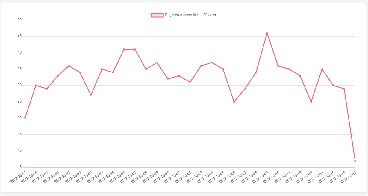
The line chart is identical to the bar chart. The only thing we need to change is in the config charts type:
const config = { type: 'line', type: 'bar', data: data};After changing the config go to your page. You should see the chart changed from bar to line.

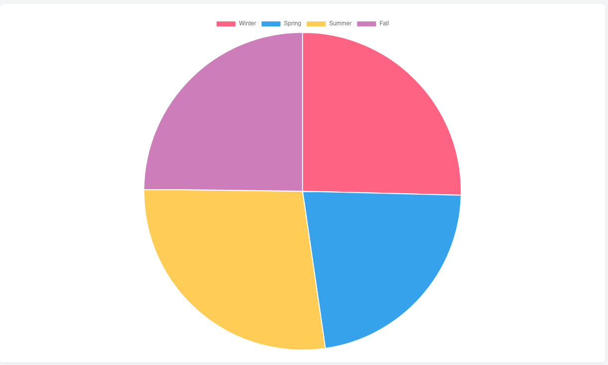
At the start of the tutorial, when preparing our Laravel app, we added the birth_date column to the users table. Now, we will use it to show, how many users have birthdays each season. Query for getting such results is this:
$data = User::selectRaw("(CASE WHEN MONTH(birth_date) IN (1, 2, 12) THEN 'WINTER' WHEN MONTH(birth_date) IN (3, 4, 5) THEN 'SPRING' WHEN MONTH(birth_date) IN (6, 7, 8) THEN 'SUMMER' WHEN MONTH(birth_date) IN (9, 10, 11) THEN 'FALL' END) as season, COUNT(*) as count") ->groupBy('season') ->get();Again, we assign results to $data variable, so don't forget to return it to your view file.
Now for the JS part, in the blade file we add this:
@push('scripts') <script> const data = { labels: [ 'Winter', 'Spring', 'Summer', 'Fall', ], datasets: [{ label: 'Birthdays by seasons', data: @json($data->map(fn ($data) => $data->count)), backgroundColor: [ 'rgb(255, 99, 132)', 'rgb(54, 162, 235)', 'rgb(255, 205, 86)', 'rgb(205, 125, 186)', ], hoverOffset: 4 }] }; const config = { type: 'pie', data: data, }; const myChart = new Chart( document.getElementById('myChart'), config ); </script>@endpushWe know that labels will be static here, so we add them manually.
For data, we just need to return the count from $data variable. And, of course, in the config we set the type to pie.
After visiting your page you should see a pie chart.

So, that's it - three simple examples of how to add charts to Laravel projects.
We also have our own free package Laravel Charts to wrap the Chart.js in even more simple way.