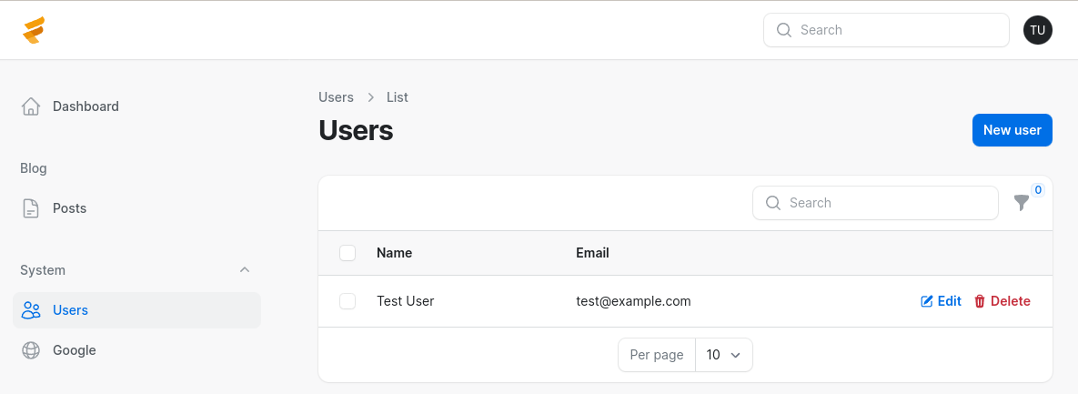
Filament has many visual customizations, which can be set globally or per panel. In this lesson, we will see some of them.
For the panel, you can set a maximum content width. Options correspond to Tailwind's max-width scale. By default, the value is SevenExtraLarge. Based on your application, you might want to make it smaller or larger.
app/Providers/Filament/AdminPanelProvider.php:
use Filament\Support\Enums\MaxWidth; class AdminPanelProvider extends PanelProvider{ public function panel(Panel $panel): Panel { return $panel // ... ->maxContentWidth(MaxWidth::TwoExtraLarge); }}
You can change a text-based logo instead of an app's name by setting a brandName().
app/Providers/Filament/AdminPanelProvider.php:
class AdminPanelProvider extends PanelProvider{ public function panel(Panel $panel): Panel { return $panel // ... ->brandName('Custom Name'); }}
You can also set a brand logo from an image or a View file where svg can be placed. The height of a logo can be set using the brandLogoHeight() method.
app/Providers/Filament/AdminPanelProvider.php:
use Illuminate\View\View; class AdminPanelProvider extends PanelProvider{ public function panel(Panel $panel): Panel { return $panel // ... ->brandName('Custom Name') ->brandLogo(fn (): View => view('logo')) ->brandLogoHeight('2rem'); }}
Navigation has a lot of customization from setting a title to building navigation items manually. Let's see some of those customizations.
Obviously, you can change the settings for every Resource menu item, with properties like $navigationLabel, $navigationSort, and others, but in this article, we're focusing only on the global customizations outside of Resources.
For example, ordering of the navigation groups can be done in the Panel Provider.
app/Providers/Filament/AdminPanelProvider.php:
class AdminPanelProvider extends PanelProvider{ public function panel(Panel $panel): Panel { return $panel // ... ->navigationGroups([ 'Blog', 'System' ]); }}Now, the blog group is first.

You can also further customize navigation groups, for example, by adding an icon and turning off collapsible only for one group.
app/Providers/Filament/AdminPanelProvider.php:
use Filament\Navigation\NavigationGroup; class AdminPanelProvider extends PanelProvider{ public function panel(Panel $panel): Panel { return $panel // ... ->navigationGroups([ NavigationGroup::make() ->label('Blog') ->icon('heroicon-o-pencil') ->collapsible(false), NavigationGroup::make() ->label('System') ->icon('heroicon-o-cog-6-tooth'), ]); }}NOTICE: Only navigation groups or items can have icons. They cannot have both at the same time!
![]()
You might need to register a custom navigation item that leads to an internal page or an external link.
app/Providers/Filament/AdminPanelProvider.php:
use Filament\Navigation\NavigationItem; class AdminPanelProvider extends PanelProvider{ public function panel(Panel $panel): Panel { return $panel // ... ->navigationItems([ NavigationItem::make('Google') ->url('https://google.com', shouldOpenInNewTab: true) ->group('System') ->sort(3) ]); }}
And lastly, the navigation can be moved to the top bar.
app/Providers/Filament/AdminPanelProvider.php:
class AdminPanelProvider extends PanelProvider{ public function panel(Panel $panel): Panel { return $panel // ... ->topNavigation(); }}
Every resource, page, and navigation item can have an icon. Icons are also used in various places, like search input.
Filament uses heroicons for the icons and the Blade Icons package from Blade UI Kit to render them.
They have a website where you can search all the available icons from various Blade Icons packages. Each package contains a different icon set that you can choose from.
When you find the desired icon, copy its full name and set it in the $navigationIcon property.
app/Filament/Resources/PostResource.php:
class PostResource extends Resource{ protected static ?string $model = Post::class; protected static ?string $slug = 'posts'; protected static ?string $navigationIcon = 'heroicon-o-document-text'; protected static ?int $navigationSort = 3; protected static ?string $navigationGroup = 'Blog'; // ...}app/Filament/Resources/UserResource.php:
class UserResource extends Resource{ protected static ?string $model = User::class; protected static ?string $slug = 'users'; protected static ?string $navigationIcon = 'heroicon-o-users'; protected static ?string $recordTitleAttribute = 'name'; protected static ?string $navigationGroup = 'System'; // ...}If setting navigation items in the Panel Provider, provide an icon using the icon() method.
app/Providers/Filament/AdminPanelProvider.php:
class AdminPanelProvider extends PanelProvider{ public function panel(Panel $panel): Panel { return $panel // ... ->navigationItems([ NavigationItem::make('Google') ->url('https://google.lt', shouldOpenInNewTab: true) ->group('System') ->sort(3) ->icon('heroicon-o-globe-alt'), ]); }}All navigation items now have custom icons.
![]()
In your application, you might want to use colors that would represent your brand.
You can register colors in the Service Provider's boot() method, Middleware, or Panel Provider. Six default colors are used throughout Filament.
use Filament\Support\Colors\Color;use Filament\Support\Facades\FilamentColor; FilamentColor::register([ 'danger' => Color::Red, 'gray' => Color::Zinc, 'info' => Color::Blue, 'primary' => Color::Amber, 'success' => Color::Green, 'warning' => Color::Amber,]);The Color class contains every Tailwind CSS color to choose from.
For example, let's change the primary color.
app/Providers/Filament/AdminPanelProvider.php:
use pxlrbt\FilamentEnvironmentIndicator\EnvironmentIndicatorPlugin; class AdminPanelProvider extends PanelProvider{ public function panel(Panel $panel): Panel { return $panel ->default() ->id('admin') ->path('admin') ->login() ->colors([ 'primary' => Color::Amber, 'primary' => Color::Lime, ]) // ... }}As you can see, where the orange color was used, now it is green.

You can also set colors from the hex code. For example, you want the colors to be similar to the AdminLTE 3 template. First, you would check the values in the template and then set them for Filament.
app/Providers/Filament/AdminPanelProvider.php:
class AdminPanelProvider extends PanelProvider{ public function panel(Panel $panel): Panel { return $panel ->default() ->id('admin') ->path('admin') ->login() ->colors([ 'danger' => Color::hex('#dc3545'), 'gray' => Color::hex('#6c757d'), 'info' => Color::hex('#17a2b8'), 'primary' => Color::hex('#007bff'), 'success' => Color::hex('#28a745'), 'warning' => Color::hex('#ffc107'), ]) // ... }}As you can see, the primary color now has a blue style, and danger is slightly darker.

Filament makes changing font very easy. However, you must be careful, as the font you choose may not support the language you are using.
By default, Filament uses the Inter font. The font can be changed in the Panel Provider using the font() method.
app/Providers/Filament/AdminPanelProvider.php:
class AdminPanelProvider extends PanelProvider{ public function panel(Panel $panel): Panel { return $panel // ... ->font('Poppins'); }}Below is a screenshot of the difference between the two fonts.

The default provider for serving fonts is Bunny Fonts CDN, which is GDPR-compliant. To change the provider, add the provider argument to the font() method.
app/Providers/Filament/AdminPanelProvider.php:
use Filament\FontProviders\GoogleFontProvider; class AdminPanelProvider extends PanelProvider{ public function panel(Panel $panel): Panel { return $panel // ... ->font('Poppins', provider: GoogleFontProvider::class); }}These are the most essential global visual customizations for Filament panels.